The Others
This project was made by a team of students, including me, learning illustration as empowering element of web design at the Sochnik Design School. The task was to design an illustrative landing page and learn to cooperate. The theme was sea slugs.
Immersive course
Sochnik Design School
My role
Concepting. Visual Design.Copywriting.
Project type
Team project
The entire project contained a landing page and additional 9 screens with CTA buttons
About the project
The Others. Already here? Its illustration theme online exhibition is dedicated to sea slugs. The illustrative landing page supposes to educate, to give a glimpse of amazing and colorful sea creatures - sea slugs. The whole project was done in collaboration with 4 other students for 5 weeks, and curated by a group of creative designers
through zoom, slack, and Figma comment feature. We had to define the concept, determine design processes assign roles, and create converting landing page. Our decision was to design a virtual exhibition that is dedicated to unusual sea creatures. For who? The target audience - families, children, teenagers, and students.
My Role
1
Concepting. Visual design.
2
Understanding, exploration, copywriting.  
3
Wireframing
4
Design, prototyping.
Problem and goals
Quarantine and isolation during a pandemic reduce the attendance of museums and galleries. We wanted to allow our users to attend virtual exhibitions remotely, to entertain, educate, and create a good mood. Help to change the focus, and relax.
The goal was to create great content and a user-friendly experience. Users can go online and have a virtual experience, enjoying beautiful, consistent, engaging, and educating content.  
The entire project contained 10 design screens
Design process and implementation
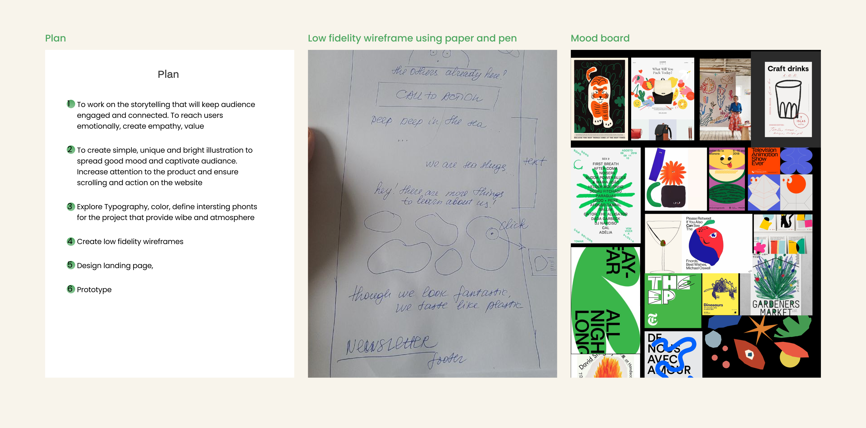
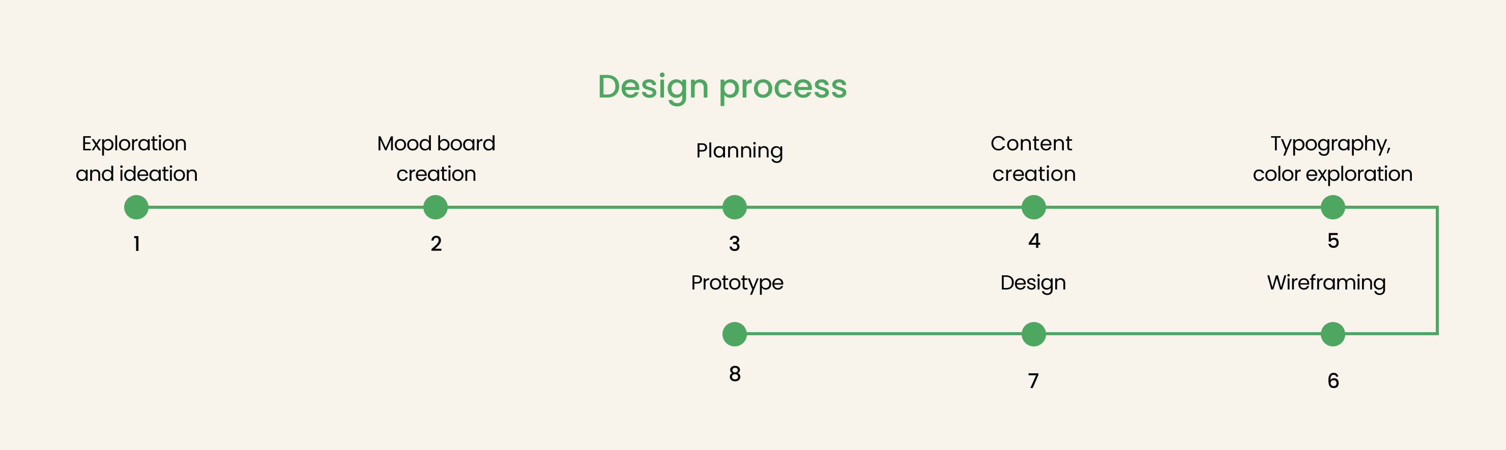
The design process included exploration and ideation, creation of the mood board and gathering references, planning,  creation of the content - storytelling, and illustrations. Typography and color exploration, wireframing, design, prototype.

We also were responsible for defining and managing our design processes. We started our project by sketching and jotting down the main points, names, and ideas for the landing page. Approving our roles in the design process as well. The idea we came up with was to transform our work into a story, with which our audience could emphasize.
The mood board and references created in Figma
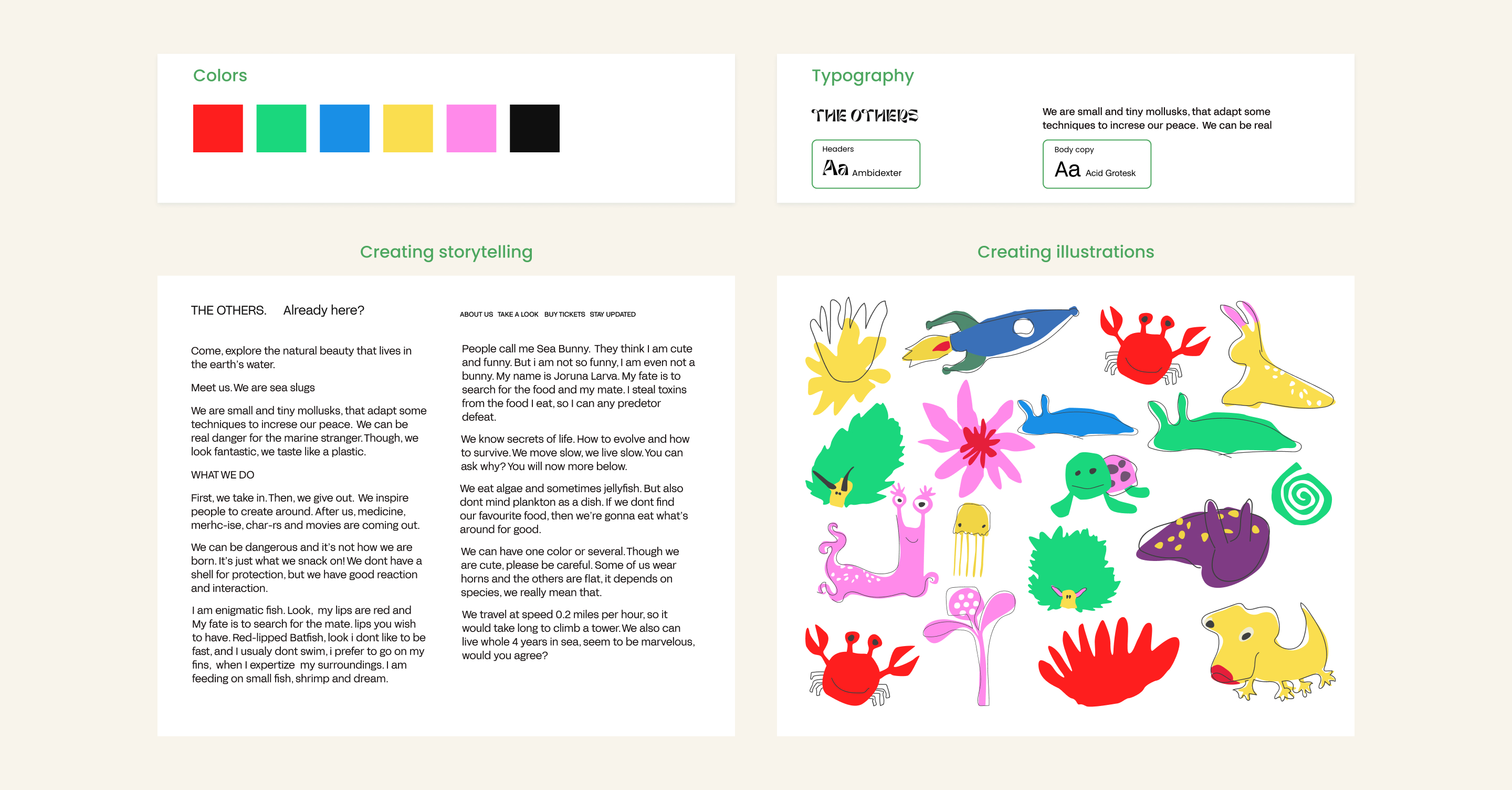
Defining basic web page design elements (fonts, color, grid)
After exploration, as a  team, we worked together very closely on defining the visual concept of the illustrative landing page, visual style, typography, and color. We worked on generating content such as storytelling and illustrations as essential building blocks. The goal was to create a strong first impression by above the fold section.
During the process, every member of the team was assigned a particular role ( typography, color, creating content-storytelling, illustrations, layout. During the design process, each member focused on what needed to do. Also, we were collaborating with each other, worked very close.
Creating content for the website and defining visual style
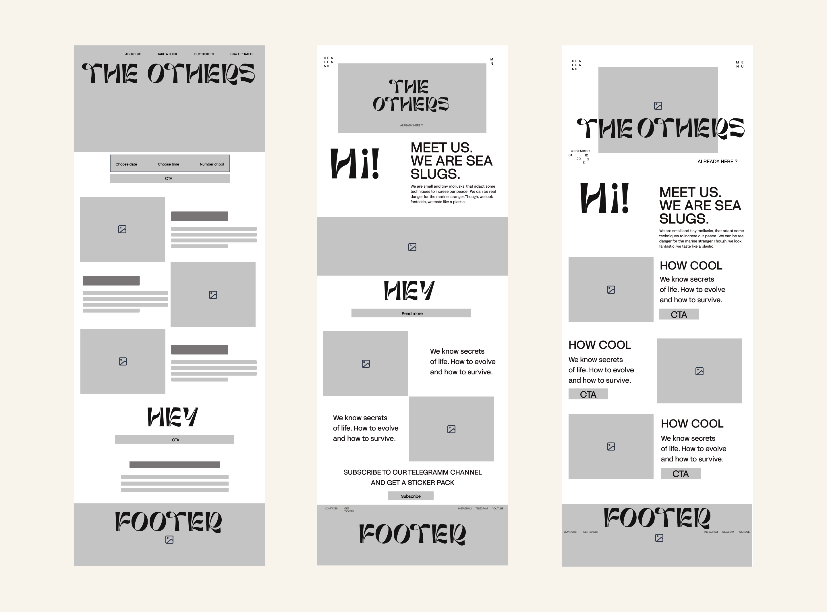
Working on the UX structure of the website. Creating low-fidelity wireframes.
We drew basic outlines of the key elements, and how we wanted everything laid out on the screen using the pen a paper. Then we digitized them using Figma, creating several low-fidelity wireframes. We received feedback from our curators, and designers, and refined sections and the composition of the elements and blocks. We worked a lot on the hero screen as well.
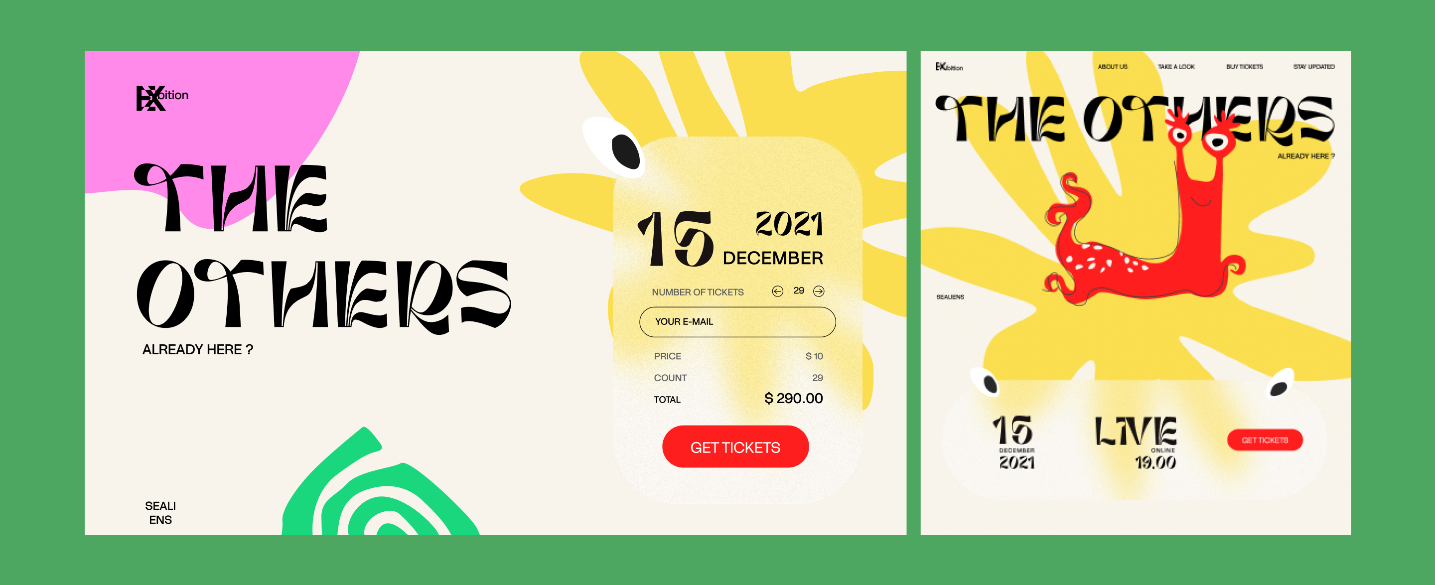
It was important for us to create a hero screen that welcomes visitors by engaging and attraction. We decided to create powerful visual effects above the fold with a big bold illustration, delicious color, and a big type to make our visitors feel the atmosphere of the landing at their first glimpse.
Low-fidelity wireframe of landing page
Creating high-fidelity wireframes.
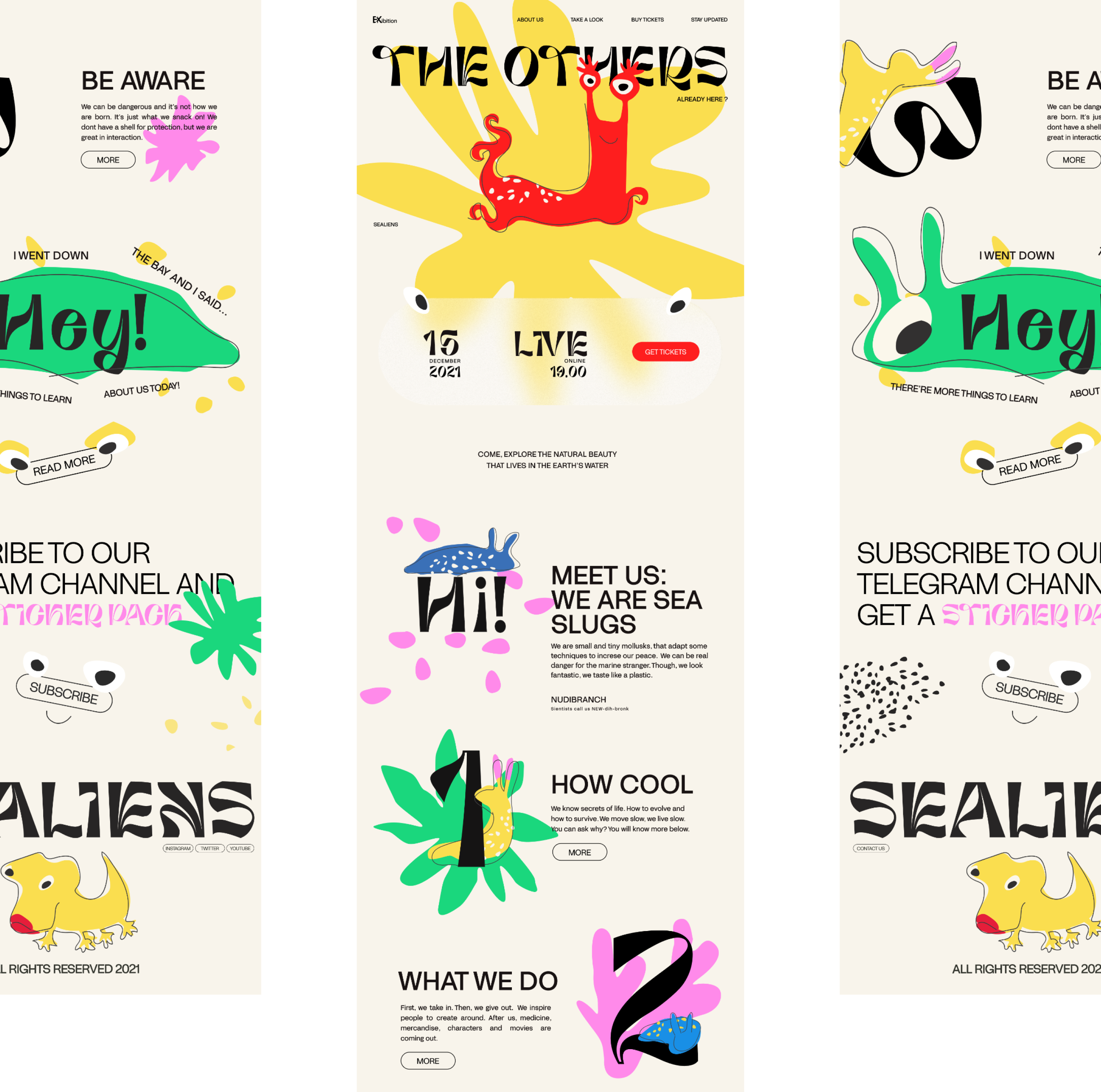
Following our explorations and content creations, we synthesized our findings and were able to create high-fidelity wireframes and design which was presented and discussed with lead designers and curators of the school. We tried to build good and trustful relationships with our audience. To make the user emphasize, enjoy, keep engaged, scroll and take action.
As long as the user's behavior is influenced by the hero image and how it's presented we chose to create powerful visual effects using big, decorative font, bold, contrasting colors, and a funny animal character that supports the messages and makes it enjoyable, adorable. This is what the landing page and other pages with illustrations and story ended look like.
High-fidelity wireframe of landing page
Design and prototype
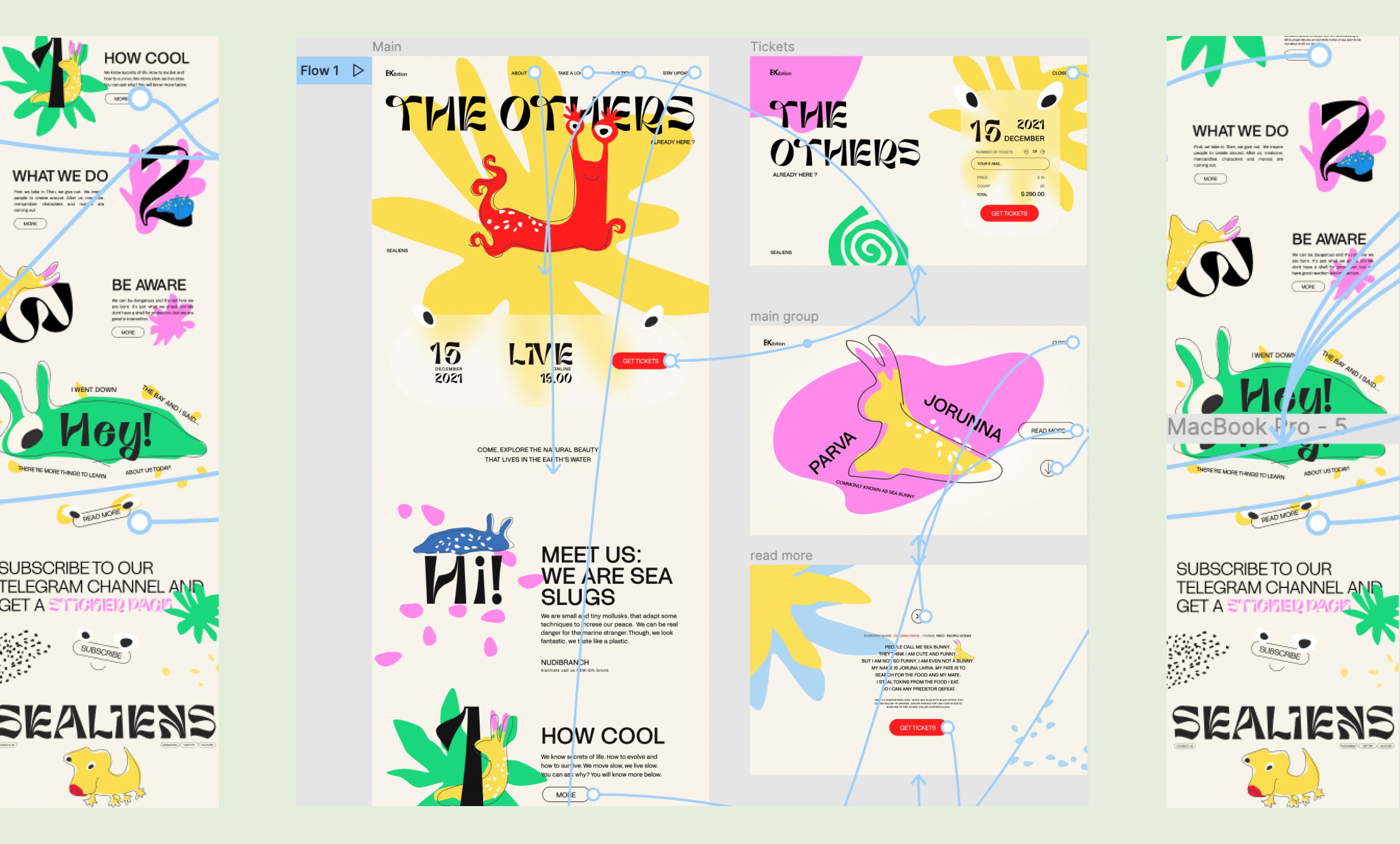
From the initial idea and throughout development I closely collaborated with a team of 4 design students and 2 curators to help create an illustrative and user-friendly landing page. Based on the high-fidelity wireframes, we polished and refined our design. The project includes a landing page and additional 9  pages of descriptions with CTA buttons.
When designing we included the placement of important elements such as an above-the-fold call to action button, proportion, and alignment of elements. We tried to work on consistency. We reached the goal to create a design and prototype in Figma as well. We also achieved our personal bests and win the contest as the best illustrative website during the course.  
Screenshots of the prototyping process