Salita Promotions
I worked with Salita Promotions Boxing Company, which represents great American fighters and Claressa Shields as well since 2010. Claressa  Shields is in the top pound-for-pound ranking in women’s boxing professional and is the first woman to headline an event on a premium television network. Salita Promotions is one of the world’s premium boxing organizations.
Customer name
Salita Promotions
My role
Visual Designer. Concepting.
Project type
Team project
Visit Site
Desktop Design
Project overview
By signing good contracts, the company has reached a higher and more recognizable level. Website traffic has increased, so the client decided to redesign it to improve visual style, accessibility, and interaction with users. The website was powered by WordPress and used a standard limited theme. For the new site, the owners decided to create a custom
theme for the site that could better reflect the philosophy of the company and empower its brand. Also, it was a necessity in creating email newsletters and banners that could be integrated into blog posts, and social media channels. As a part of social media integration strategy.
My Role
1
Visual Design. Concepting.
2
Banner’s , email newsletters design.
3
Creating components.
4
Crafting low, and high fidelity- wireframes.
Problem and goals
The objective of the project was to improve the design and usability of the website as long as the structure of the existing website was outdated. The website was powered by WordPress and used a standard limited theme, the owners decided to create a custom theme for the site, integrate new logo and improve visual identity.
The goal was to create a custom, functional and consistent website, that can represent fighters and highlight events/news, and convert users to youtube channel subscribers. To create a new structure, and add important pages, integrate a new logo, create a new visual identity.
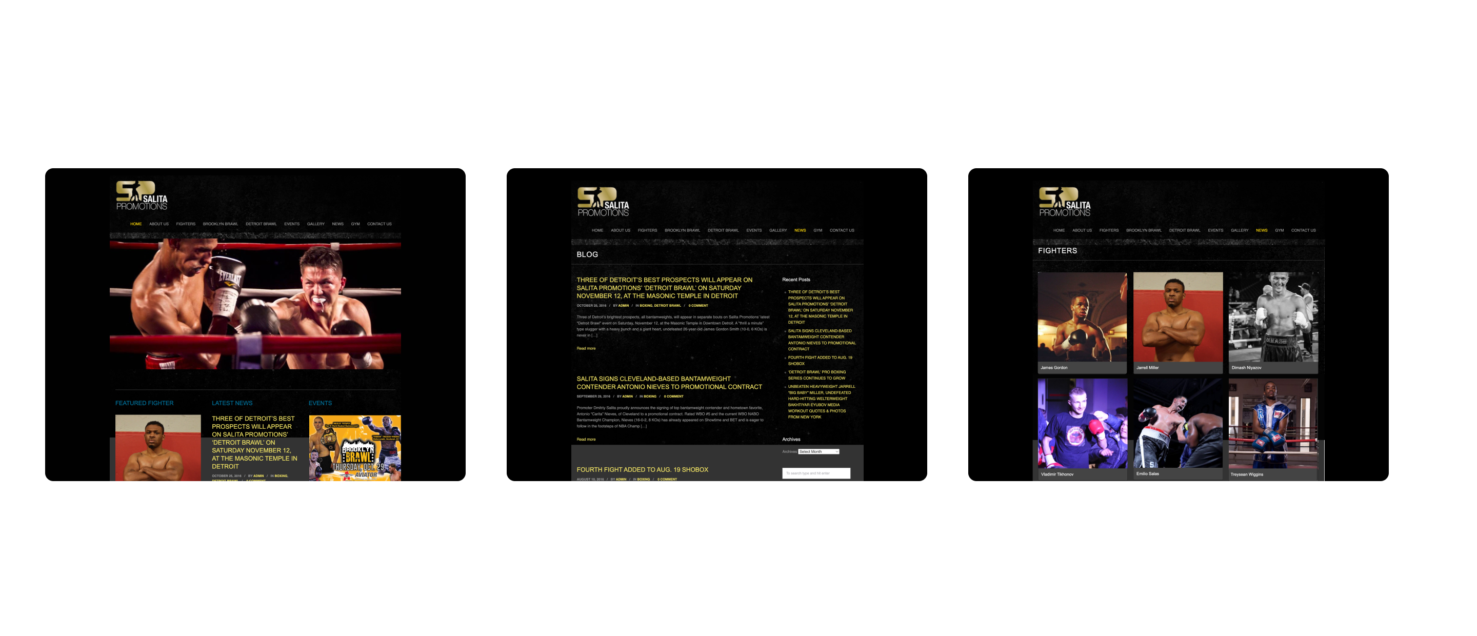
The old design of the main page and news blog of Salita Promotions
Design process and implementation  
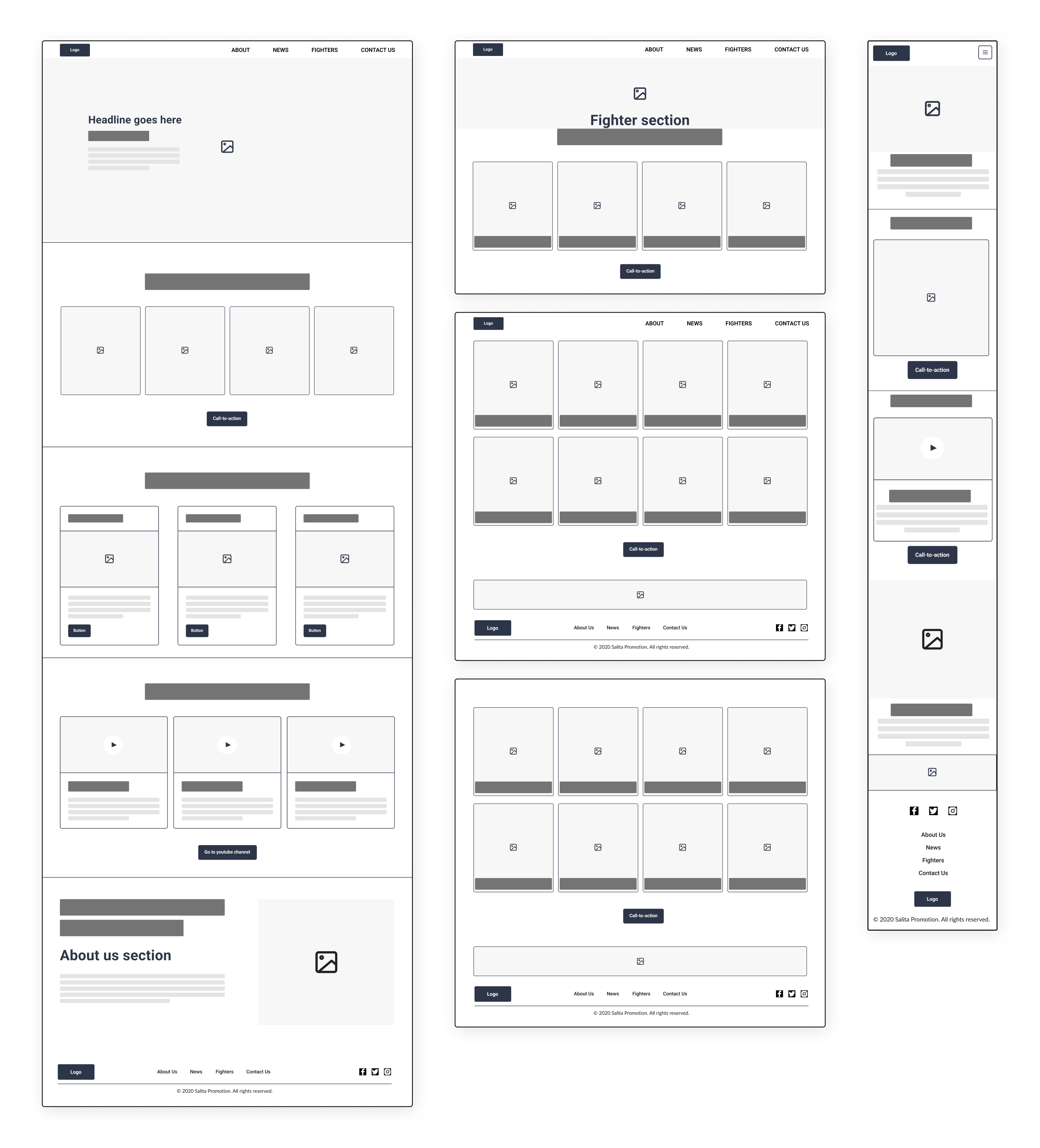
On this project, I worked in a team with another designer. Both, on the website's structure and visual identity. We sorted the given wireframes and explored competitors. After looking at competitors, we decided to refine the structure of the website by adding new pages, footer, cta buttons, and simplifying navigation. First, I sketched simple outlines on paper. I've made an order of sections, offered a basic structure of the user interface, and added basic elements.
Next, I transferred all outlines to Figma and shared my file with a lead designer and client. The wireframes were a subject of discussion and editing during the design process as well. We tested a few variations and landed on the wireframe shown below.  At this stage, we also explored the look and feel of the future website by creating mood boards, gathering references, and defining the visual style of the site.
Examples of low fidelity wireframes
Design system and style guide
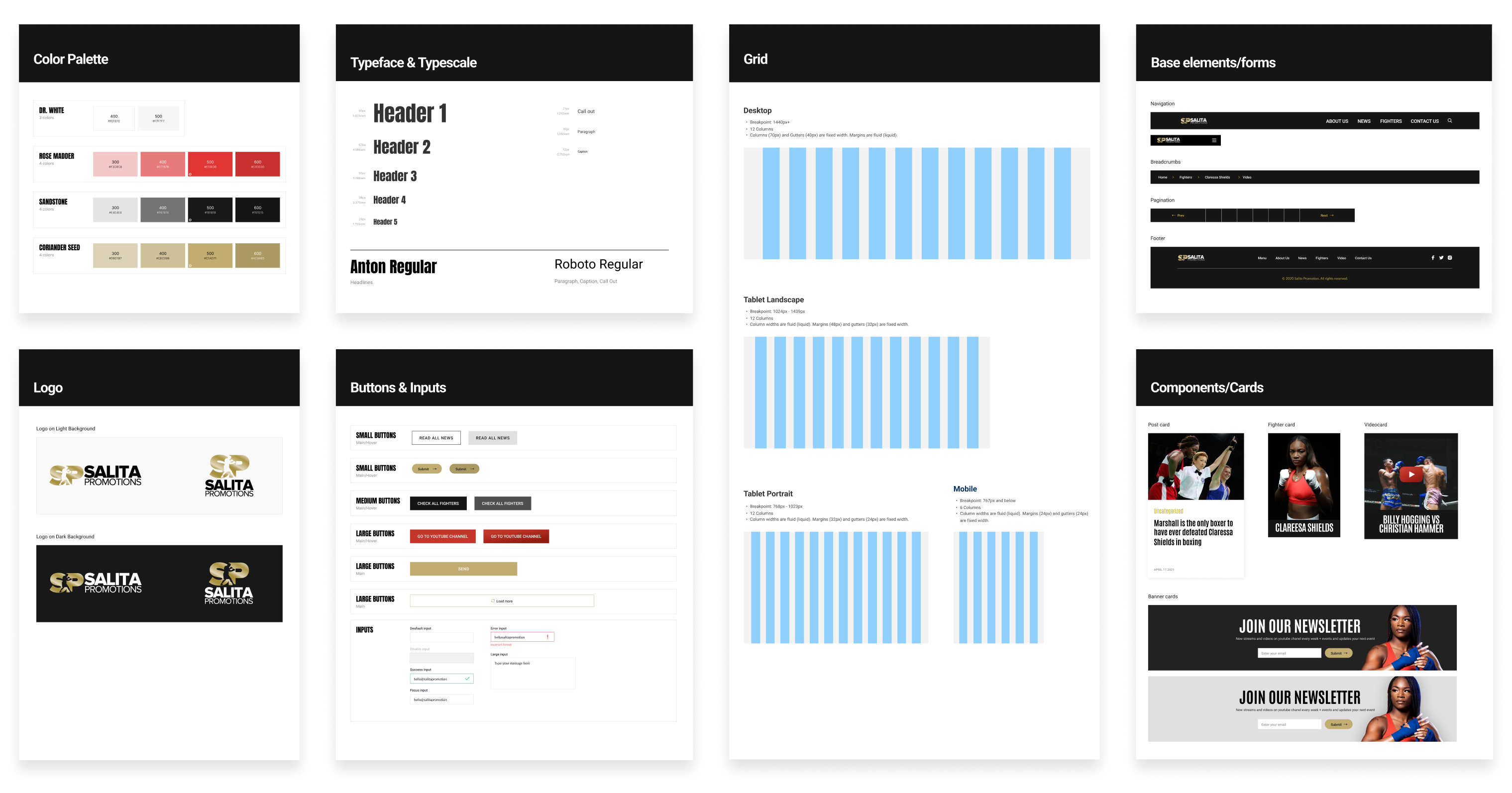
The goal was to empower a visual identity. Convey the message of energy, power, and success and improve accessibility and legibility of the user interface. Considering color psychology and the direct association with boxing we chose vibrant, contrasting red, black, white, and shades of gold colors that are accessible, and also symbolize power, motivation, and energy. Considering so many page views, loading time, and legibility, typography was a key challenge. We decided to go with Google fonts such as Roboto san-serif for all body copy, and extremely tall and heavy with condensed proportions - Anton san serif.
Also, I created grid, text, and color styles in Figma so I or my teammates can easily use them throughout the design. One of the steps in the design process was to create a UI library of our elements and forms in Figma and save them as assets. It allowed us to stay consistent and organized on the stage of creating high-fidelity wireframes. I created the Ui library of cards, buttons, inputs, and pagination as components. Creating the UI library was challenging, but rewarding. It helped to maintain the consistency of the designs and saved us lots of time.
Base UI elements/components used to build pages of the website
Creating high-fidelity wireframes
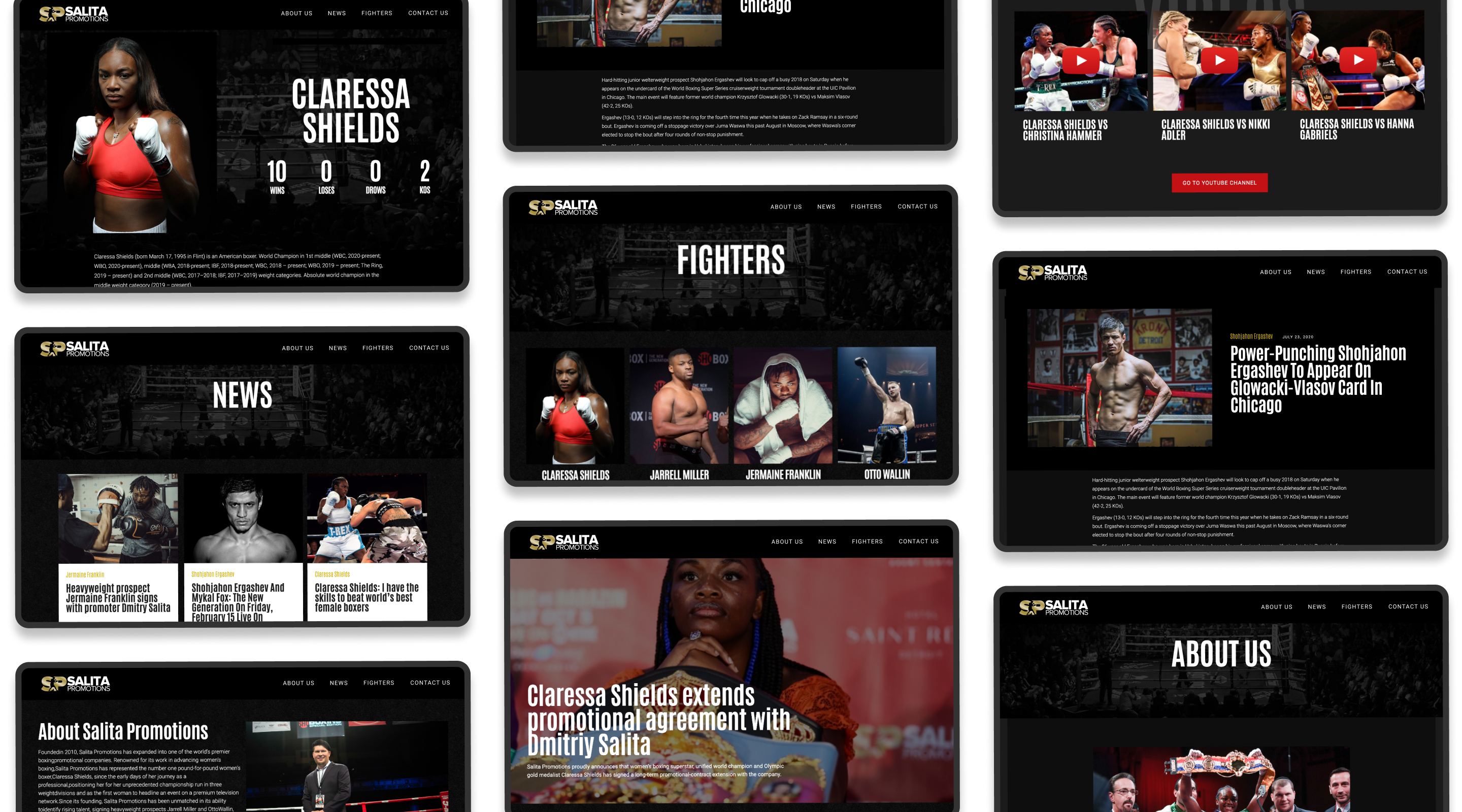
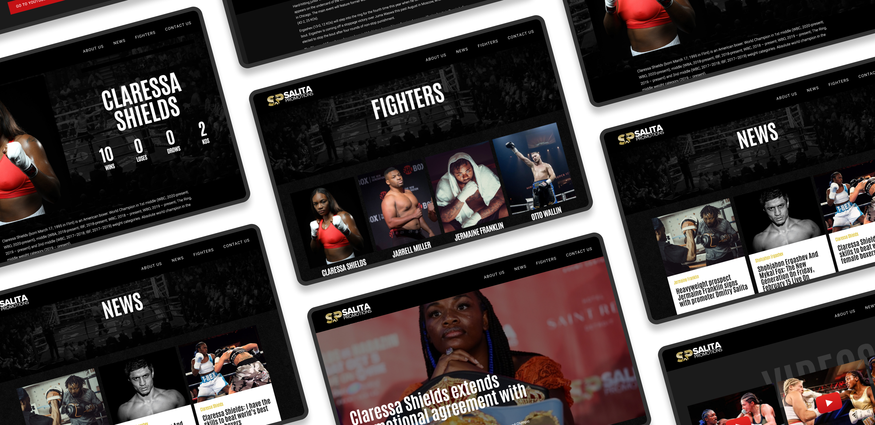
I used Figma to create high-fidelity wireframes and designs of pages as well. I went back to the style guide and implemented UI elements, forms, and components to create the following pages: landing page, fighters, card of the fighter, news, and news posts, about us, and contact us pages.
I strived to combine and organize the information we have been working on with the lead designer into a consistent design and information easier to find. It was important for the client to get traffic from mobile devices and users of social channels so I worked on mobile screen design as well.
High fidelity wireframes
Creating banners for Salita Promotions boxing events
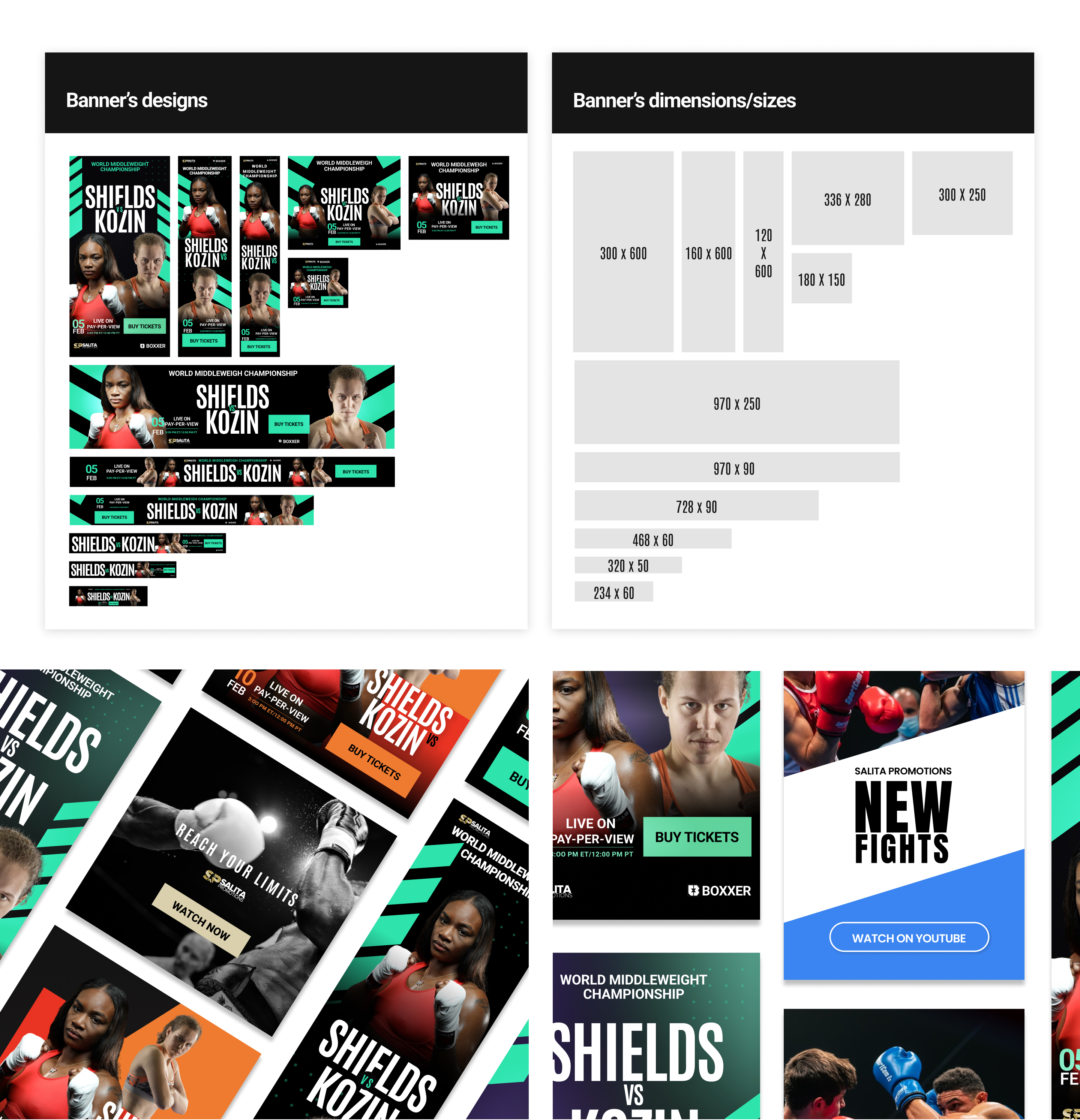
The customer asked to create standard banners for the fight event between Claressa Shield and her opponent promoted by Salita Promotions. The banners shall incorporate into social media platforms, and email newsletters, and going to be used on websites as a part of online marketing. As the first step of my process, I explored and defined the dimensions of standard banner ad sizes.
Then I created a canvas with banners of all needed sizes in Figma and saved them for future projects as well. Next, I was discovering what information should be displayed on banners and also was given a file with the logo and assets, names, dates, and sponsors. I experimented with colors, spacing, shapes, typography, and composition. I used the grid and fundamentals of design to organize and align the content. 
Examples of banners
Email newsletters design
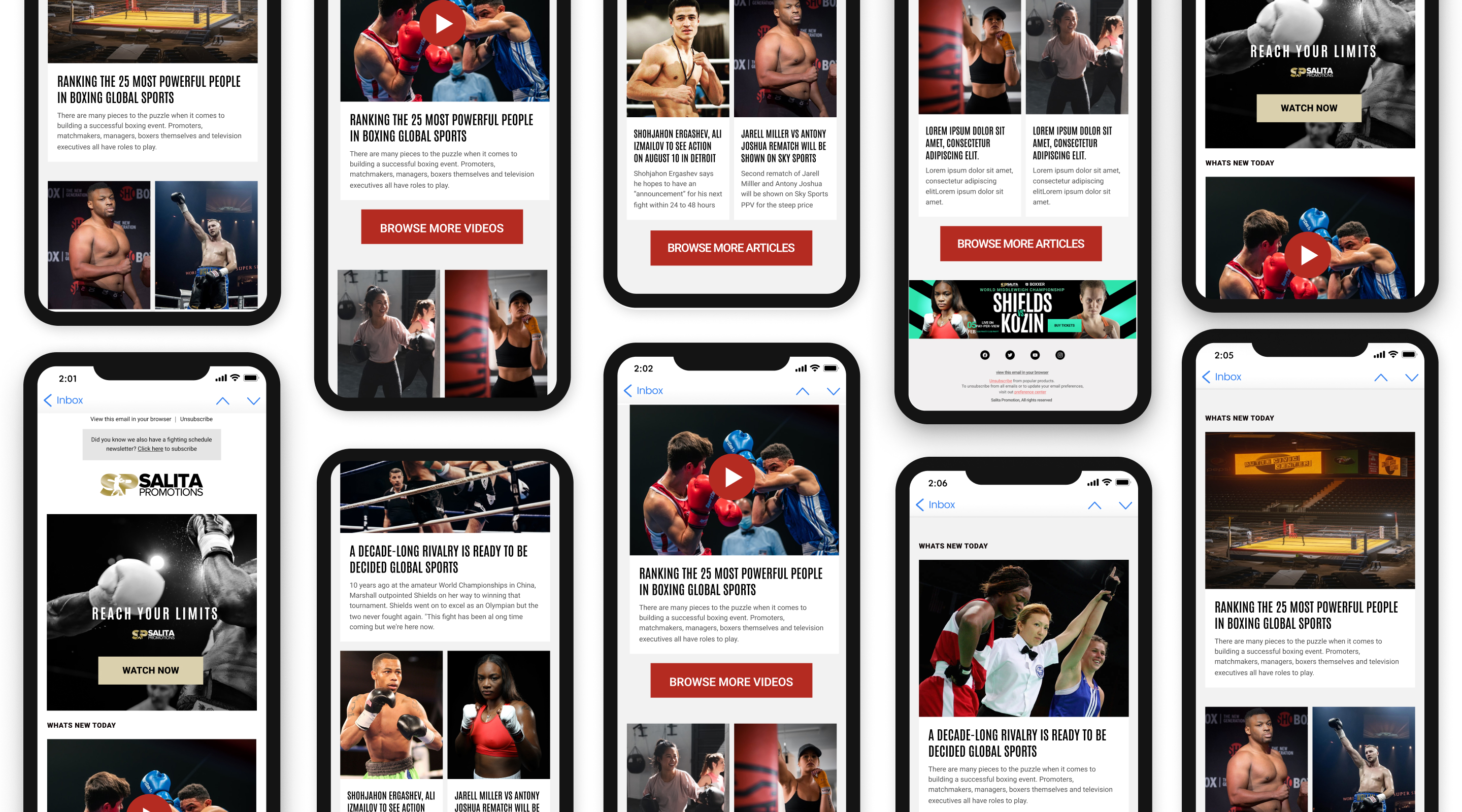
Salita Promotions company provides streams of videos on its youtube channel, so it was important to increase its conversion rate by directing the audience through email newsletters and other social media channels. I was asked to make templates, and banners to promote events, boxing shows, and links
to new videos on the youtube channel. I tried to integrate videos, articles, and fighter information into the design. I used Figma features such as auto layouts and components to create reusable elements, assets that I can use throughout the design. I used a style guide for typography and color.
Mobile-first design of layouts for email newsletter