Taiyo
This project was made as a personal student work for the Sochnik Design School based in Kharkiv, Ukraine. The task was to build an e-commerce website from a scratch for a product that people can buy that was associated with number eight (8).
Immersive course
Sochnik Design School
My role
Concepting. Visual design. Ui/Ux.
Project type
Personal project
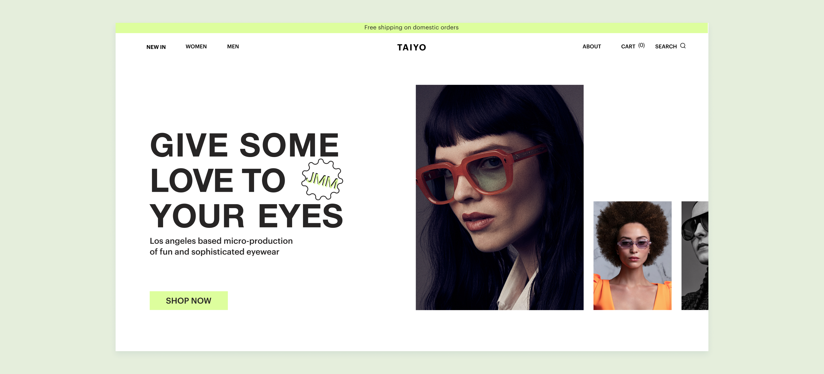
Hero Screen Concept
About the project
I faced a unique scenario for my personal project. I was assigned the task to design an e-commerce website for a product or service related to the number eight.  As long as the number 8 reminds the shape of eyewear, I chose to design the online store for sunglasses.
For content, I used sunglasses of a Los Angeles-based brand JMM. It is known as a production of a limited-edition collection of sunglasses. They use precious materials and unique techniques. I was challenged to craft visual design including working on the experience. 
My Role
1
Product thinking. Exploration.
2
Visual design. Exploring and defining visual style and design elements.
3
Creating a style guide, components, and managing building blocks.
4
Wireframing. Creating low and high-fidelity wireframes.
Problem and goals
The goal was to design 10 pages for an e-commerce website with a thoughtful and attractive design from the scratch. Including a simple purchase, and payment experience for the user. It was challenging to make clear checkout processes, make the system of UI elements and navigate through the multi-step process.
I  learned to maintain consistent branding and develop a design system by creating text, grid, and color styles and creating components as well. Learned how important a clear and simple purchase and payment experience is for the user instead of beautiful, but long and confusing checkout processes.
The entire project contained 10-15 design screens
Design process and implementation
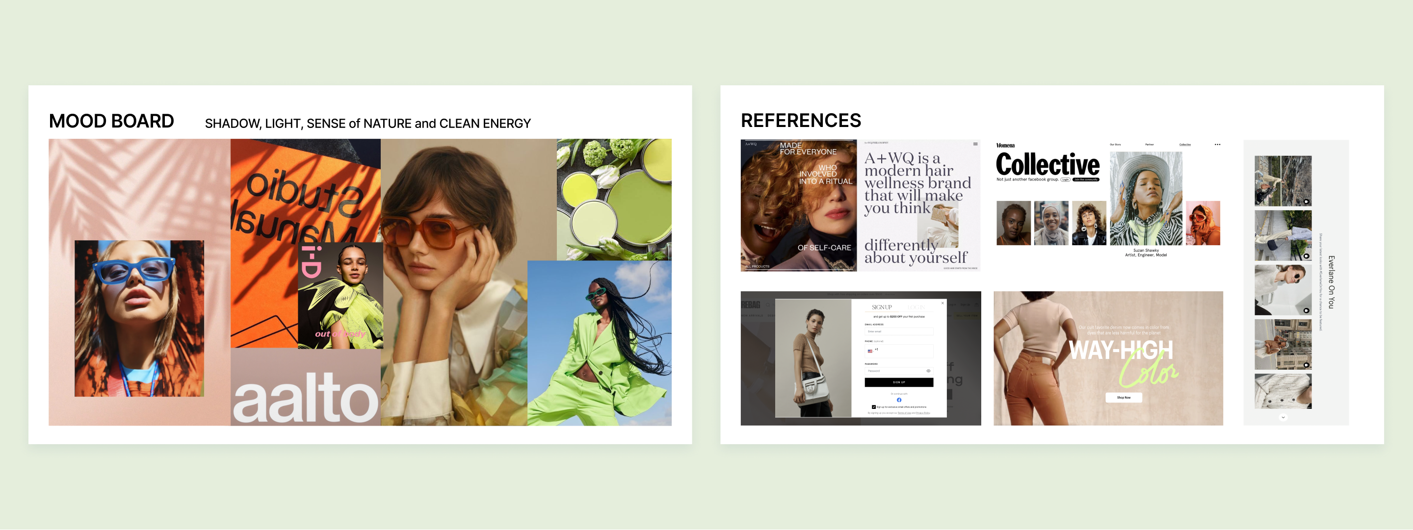
Research of competitors and the creation of the mood board was my start point. First, I researched and analyzed websites from my segment. I created a mood board and gathered references that might be included fonts, graphic elements, interactions, and other visual inspiration and
solutions. It allowed me to define the visual concept, and directions for my project. The next step was to work on the exploration of typography, color, and content, such as copy and images of the product. The images of eyewear were downloaded from the JMM website.
The mood board and references created in Figma
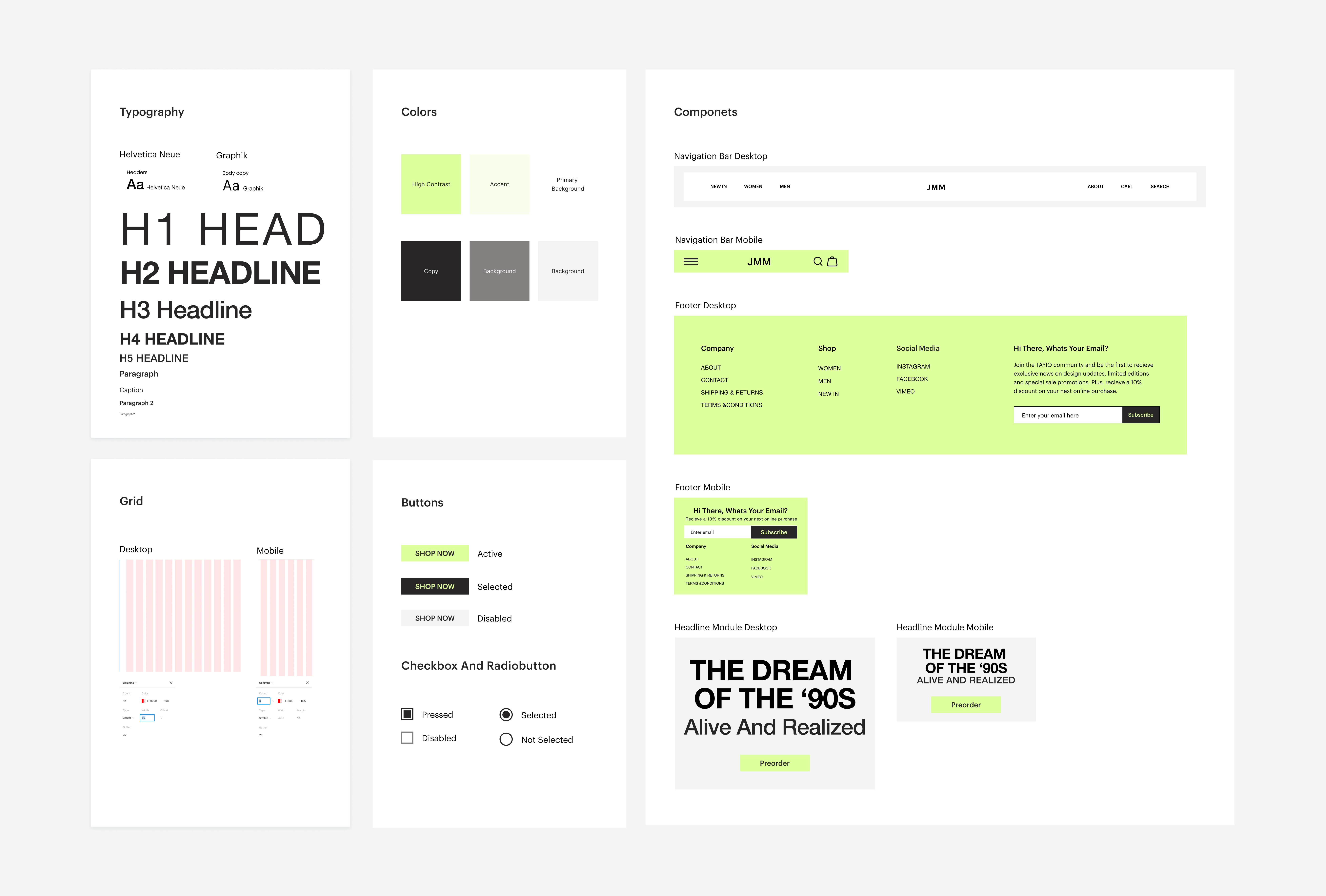
Defining basic web page design elements (fonts, color, grid)
After exploration, my task was to manage typography and text styles, choose the right color scheme, and define a grid to organize and align the content on the pages as well.
I chose to work with the following pair of sans-serif fonts Helvetica Neue and Graphik. I found these fonts as adding value and modernity to my design. They are both good and easy to read headings and titles and a copy as well.
The primary color was based on one of the references, then I defined accent color based on primary through the Coolors, the color generator. I chose white for the background and shades of black and grey for the copy. Afterward, I decided to align all the layouts according to the 12px grid with  35 px gutter and 80 px width of columns. I pinned the principle of the 8pt grid system for the spacing of elements.
UI Library of design fundamentals and components
Creating UI library of components in Figma using atomic structures
After identifying design elements I‘ve created cards of building blocks using Figma to manage the next steps of design. I created text styles, color styles, and grid styles as an atom. Individual button and their variants as molecules, and I also created complex entire navigation, footer,
and headline modules as organisms using atomic structure.  Some elements were edited along the process. For example, changing the size and color of the menu, footer, and different states of the buttons. I created components and saved them as assets in Figma.
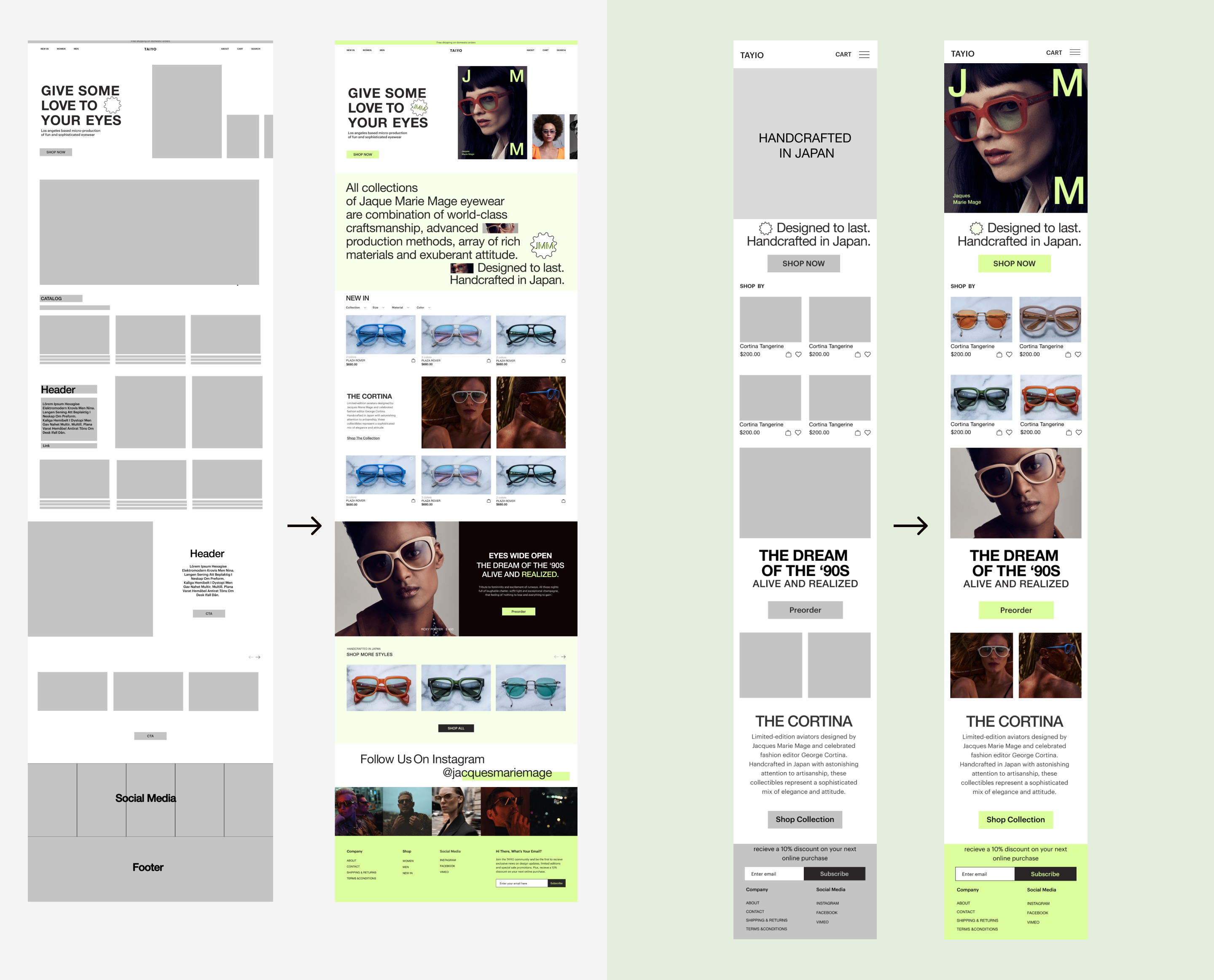
Working on the UX design and creating low-fidelity wireframes.
Wireframing. First, I drew basic outlines of the key elements, and how I want everything laid out on the screen using the pen a paper. Then I digitized them using Figma.
The wireframes were either confirmed or denied by my curators, so I had to create and recreated wireframes including improving indents, alignments, sizes, thoughtful content, and composition along the way.
Desktop low-fidelity wireframe
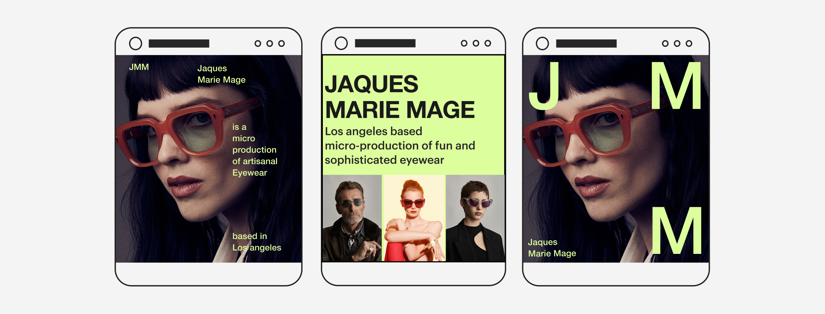
Mobile low-fidelity wireframe
Converting low fidelity into high-fidelity wireframes and design
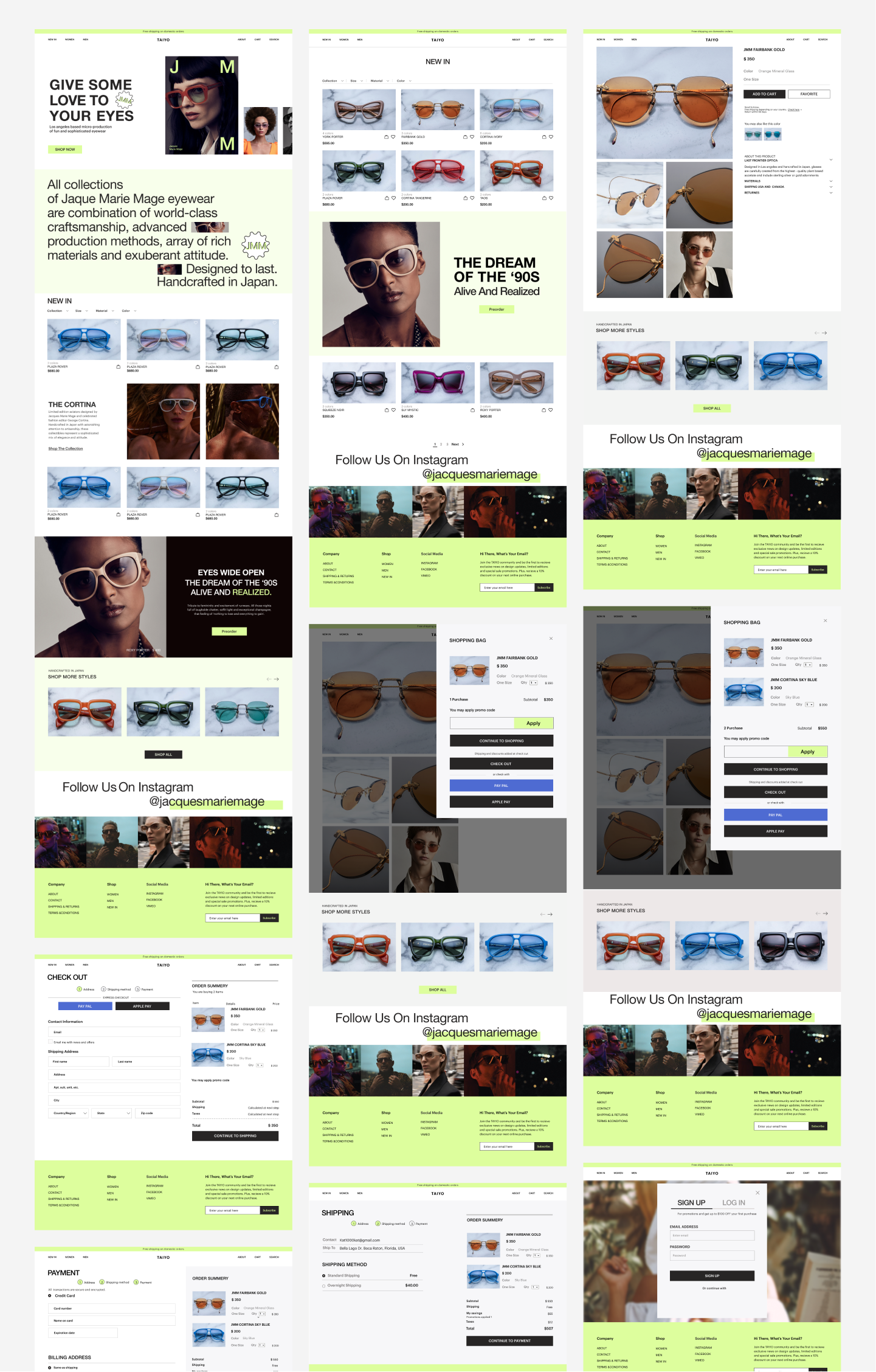
Based on low-fidelity wireframes, and recommendations from curators I moved to polish and refine my screens in Figma. I  created high-fidelity wireframes using assets, images, components, and a copy to build different blocks and sections of the design. Including principles of design, alignment, and hierarchy.  I worked using created UI systems and building blocks as well.
The project includes 10 wireframes: home page, catalog, product page, shopping bag, checkout page, sign up page, log in, about us, wishlist, 404 page, and responsive design for mobile.  Wireframes and UI elements were based on the size requirements, including the placement of important elements such as a call to action, above-the-fold buttons, proportion, and alignment of elements. 
The entire project contained 10-15 design screens